UC San Diego · Jacobs Center for Health Innovation · Student Health & Well-being
Reframing student belonging as an upstream health intervention.
Bloom is a concept platform pitched to reframe student isolation and disconnected campus programming as a preventive well-being issue. Initially stemming from my research on “Willo”, I designed a behavior-change system that is designed to assist students from “I don’t know where to start” to showing up, before disconnection becomes a clinical concern.
Role
Product Designer, UX Strategist, Content Designer
Partners
Campus health & well-being partners
Timeline
2026 - Present
Scope
Concept pitch, end-to-end product strategy & prototype
Context
01
A campus rich in resources but fragmented in how students discovered and engaged with them.
Most campuses already fund and run a meaningful amount of community-building infrastructure: peer programs, recreation, identity-based groups, wellness workshops, volunteer opportunities. The Jacobs Center for Health Innovation and Student Health & Well-being weren’t short on programming. They were short on students who knew it existed, knew it was for them, and felt ready to walk in the door.
That gap matters more than it sounds. Loneliness and disconnection are well-documented predictors of declining mental and physical health in college-age students, and they’re also the hardest thing for a campus to address through a single department, because belonging doesn’t live inside one office’s budget line. It lives across recreation, housing, identity centers, academic advising, and student health, each running its own calendar, its own sign-up flow, its own Instagram.
UC San Diego's 45,000+ students had access to a comprehensive network of support, from counseling and crisis response to academic assistance and basic needs services. The challenge wasn't a lack of resources. It was knowing where to start. More than 40 separate campus and clinical systems each organized information around the department that owned it rather than the student trying to find help, forcing students to navigate the university's organizational structure before they could navigate their own needs.
40+
campus departments and programs running independent, disconnected community offerings
SRC: internal campus program research
8
research sessions conducted: 4 student interview sessions, 4 staff sessions with SH&W and CAPS
SRC: Bloom discovery research
1
unifying entry point proposed, organized around student readiness instead of department ownership
SRC: Bloom concept
Research
02
I ran discovery research in two tracks: four sessions with students, focused on how they currently find (or fail to find) community on campus, and four sessions with staff from Student Health & Well-being and CAPS, focused on how they see disengagement and isolation show up before a student ever reaches a clinical setting.
Students consistently described uncertainty, not a lack of opportunities, as the primary barrier to participation. The barrier wasn’t awareness. It was activation. Students struggled to identify one action that felt relevant, low-risk, and achievable; the issue wasn’t a content gap, it was the activation energy required to take a visible first step.
The staff sessions reframed the stakes. SH&W and CAPS staff consistently described disconnection and isolation as something they see well before a student is in crisis and as something that, left unaddressed, tends to compound. That conversation is what shifted this project from a “community app” pitch into a well-being-innovation pitch: the design opportunity wasn’t engagement for its own sake, it was getting in front of isolation early, in a register that didn’t feel clinical.
The barrier wasn’t interest in community. It was uncertainty about taking the first step.
“I know there are clubs for basically everything here. I just don’t know which one is for someone like me, who hasn’t done this before.”
— Undergraduate student, research session
“By the time isolation shows up in our office, it’s often been building for a while. We rarely get to meet a student at the very first, smallest step.”
— Staff partner, Student Health & Well-being
The opportunity wasn’t a better events directory: it was a system that meets students at the smallest possible first step, before disconnection becomes something a clinical team has to address downstream.
Problem framing
03
Turning “we have enough programs” into a structure organized around readiness, not departments.
STRATEGY 01
Organize by readiness, not by department
Recommendations are built around how ready, busy, or comfortable a student is right now, not around which office owns the program.
STRATEGY 02
Reduce the activation energy of the first step
The first action a student takes should be small enough to feel low risk: RSVP to one thing, message one person, join one small group.
STRATEGY 03
Earn trust before asking for vulnerability
Identity and openness are built gradually. The system should never ask a student to be more visible than they’re ready for.
The solutions
04
The design centered on one strategic objective: helping students take the first step toward belonging. Rather than exposing every campus program at once, the experience was intentionally designed to reduce uncertainty, lower the emotional cost of participation, and guide students toward one achievable next step. The examples below show how that principle shaped the product from discovery through ongoing engagement.
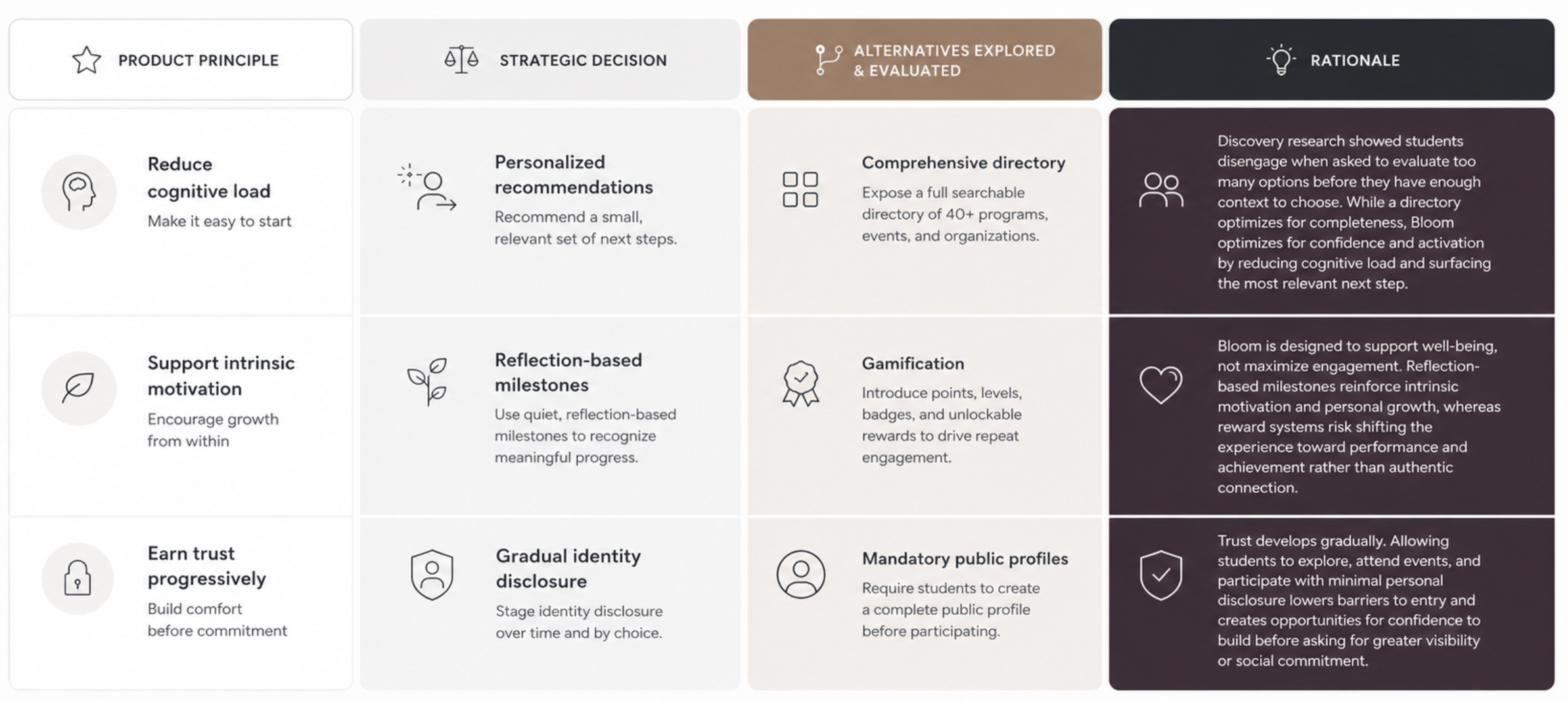
Design Decision 01
Reduce cognitive load by recommending one next step instead of presenting a directory.
WHY: Research showed students disengage when asked to evaluate a full list of options before they’ve built any confidence.
1 | One light-touch recommendation, not a wall of options
The home surface leads with a single “next event” and a short, curated set of low-commitment options, not an exhaustive list of every program running that week. This is the direct interface expression of reducing activation energy.
2 | Organize around student intent instead of organizational ownership
Recommendations are organized around interests and prior behavior rather than which campus office runs the program; a student looking for connection never has to know or care that recreation, housing, and identity-based programming sit in three different systems.
3 | Support without increasing social pressure
A simple companion presence frames the experience as supportive rather than evaluative; important for a population research showed is sensitive to feeling watched or judged when reaching out for connection.

This interface operationalizes the design principle of reducing activation energy.
A single next step, a small curated set of low-commitment options, not just a directory.
Design Decision 02
Extend belonging beyond event registration into sustained participation.
WHY: Research showed students were seeking more opportunities for genuine, in-person connection. The product needed to support the transition from browsing events to building real-world relationships.
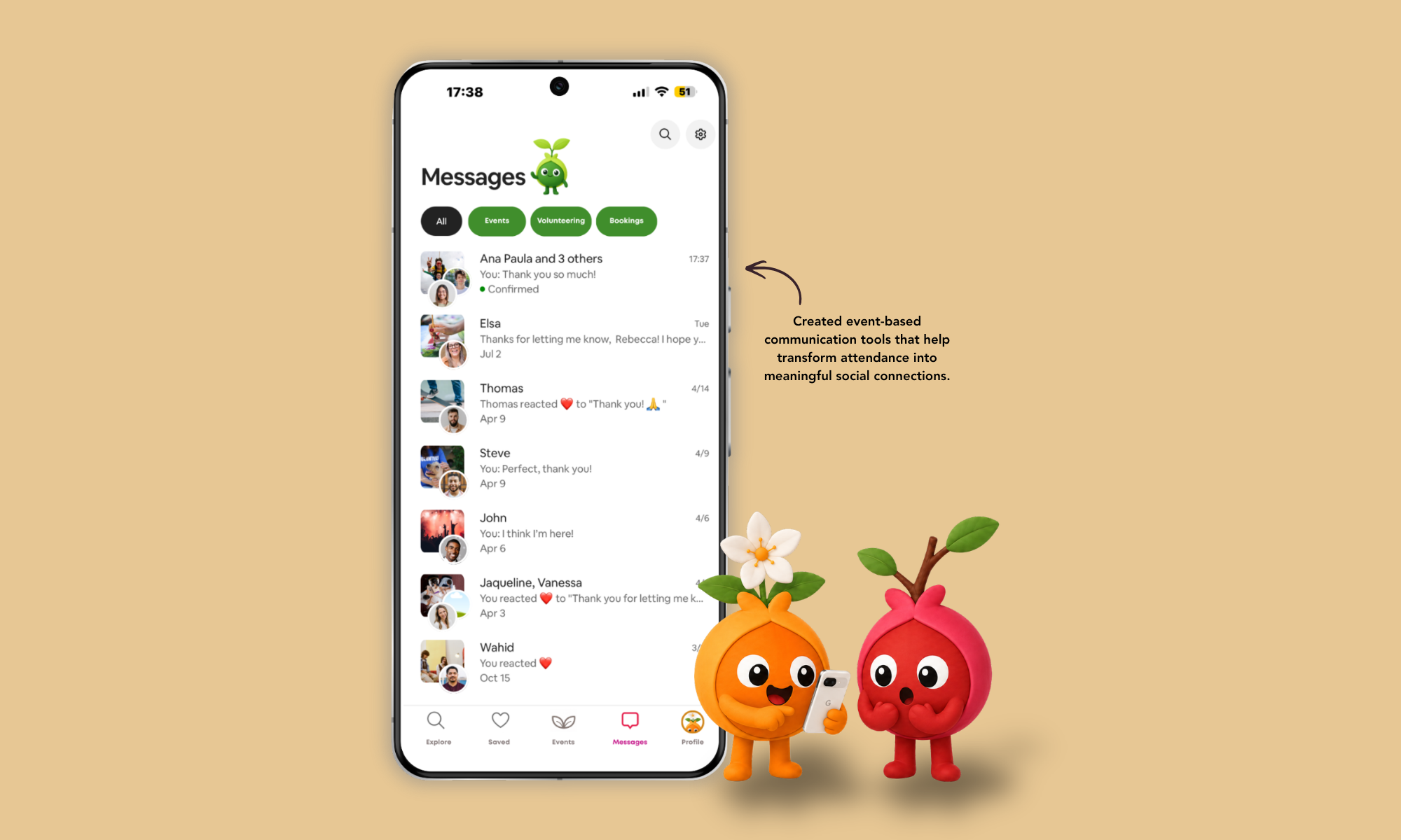
4 | Event-based messaging turns attendance into a relationship
Conversations are organized around the event or group a student joined, not a generic inbox. This is designed to turn a one-time RSVP into an ongoing thread with the specific people a student met.
5 | Confirmation and reminders reduce no-show anxiety
Lightweight confirmations (“Confirmed,” reaction-based replies) lower the social risk of committing to something new, which staff partners flagged as a quiet but real barrier for first-time attendees.
This interaction extends belonging beyond event registration into sustained participation.
Conversations are anchored to the event or group a student joined.
Design Decision 03
A companion that reduces uncertainty while reducing the emotional cost of taking the first step.
WHY: For students uncertain about joining a new group or attending an unfamiliar event, the companion helped reduce the emotional friction of taking a first step.
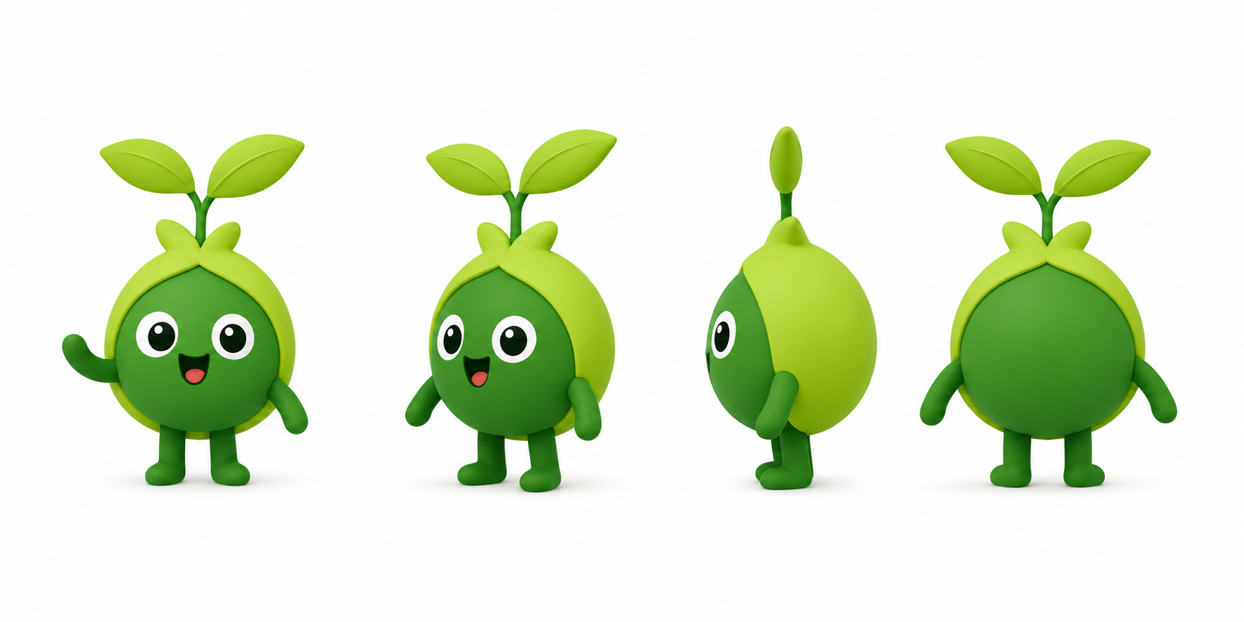
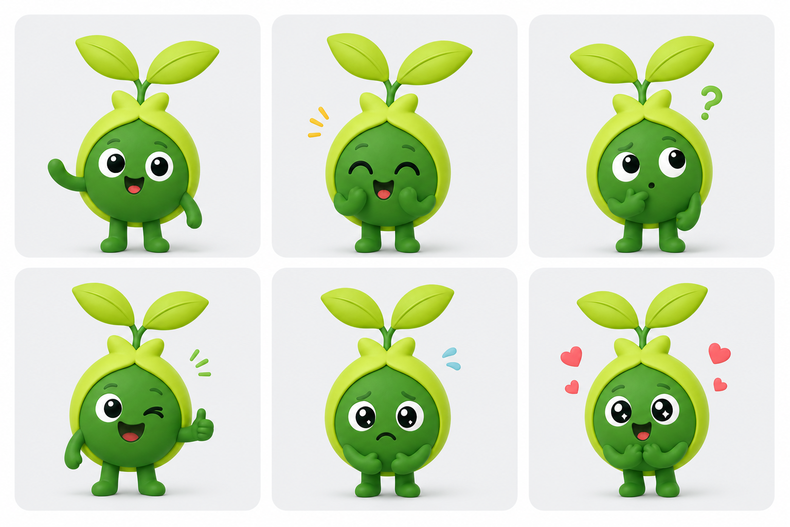
CHARACTER DESIGN — CASE STUDY
Sprout
An assistant mascot for Bloom, designed as a reusable visual system rather than a one-off illustration.

Role
Lead character design
Character Details
Sprout represents a friendly seed that is growing through connection and friends
Deliverables
Model sheet, rig, expression set
Construction
Front, three-quarter, side, and back views locked to one proportion system before any expression work began.
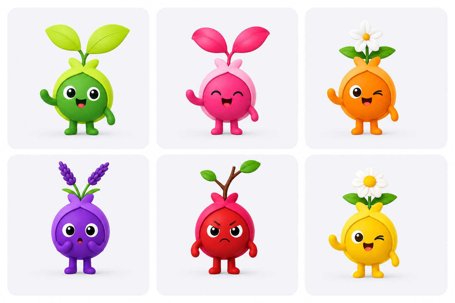
Color System
Five brand colors assigned to fixed character regions. Color placement remains consistent across all poses, expressions, and product surfaces to reinforce recognition and maintain visual continuity.
Primary Body — #2D7A3B
Hood / Outer Leaves — #ABE063
Stem & Arms — #2F8A3F
Eyes & Highlights — #FFFFFF
Mouth Accent — #FF6B6B
Rig pieces
Modular eyes, brows, mouths, and arm positions.

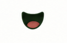
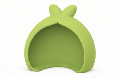


Expression range
Six expressions assembled entirely from the rig kit; no new drawings required per emotion.
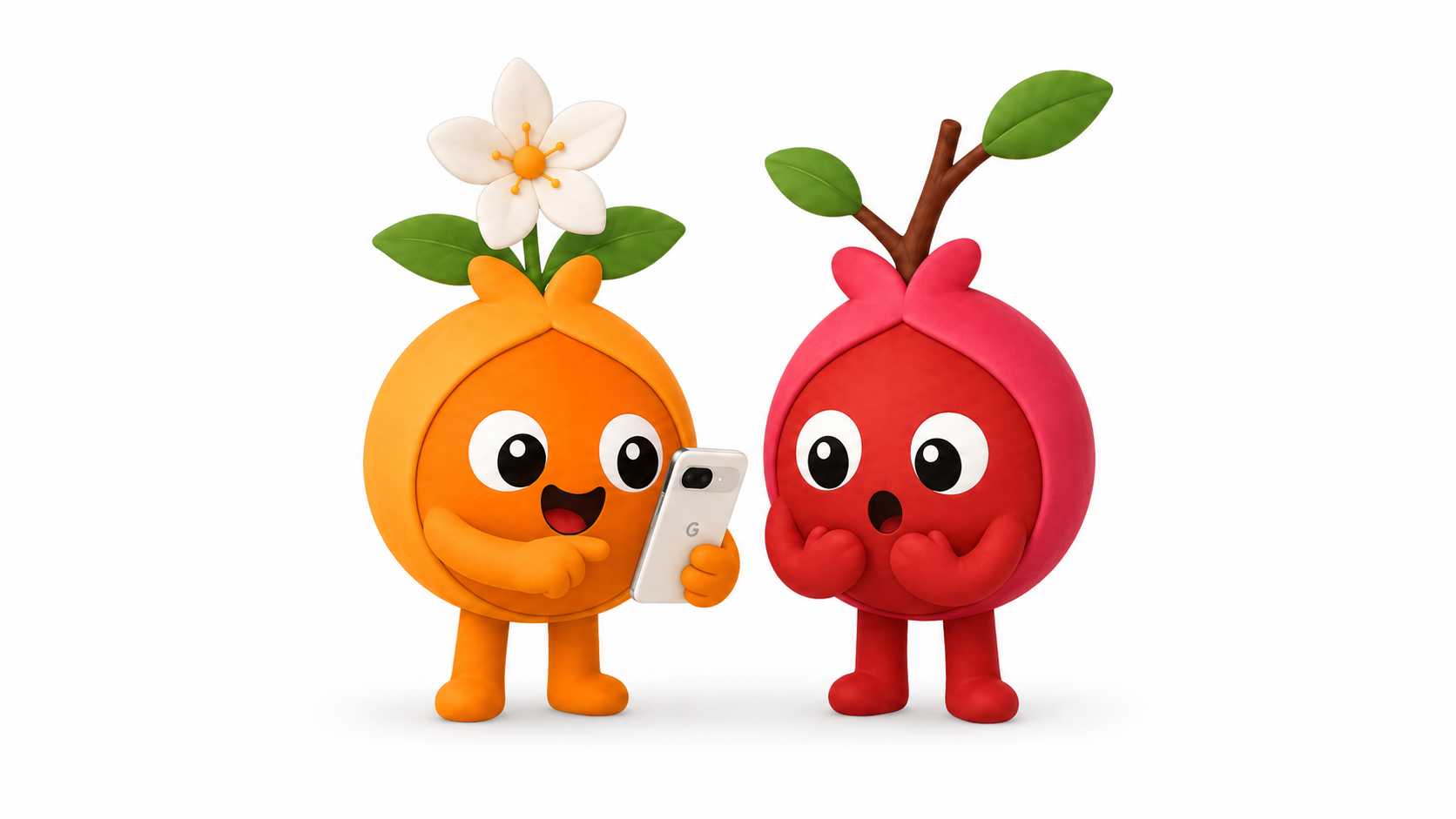
In context
Placed in a real product surface. The companion concept tested well for warmth and approachability.

Every product decision is a trade-off. Rather than optimizing for feature breadth or engagement metrics alone, these decisions prioritized confidence, trust, and meaningful participation. The ultimate goal is helping students take their first step toward connection with less friction.
05
Strategic Design Trade-offs
Future Opportunities & Goals
06
From guided discovery to guided conversation: an AI assistant layer for Bloom.
Bloom aims to help students discover communities, events, and campus resources through search, browsing, and recommendations. Those pathways work well for exploration, but they still require a student to translate an internal goal, often a vague or emotional one, into the product’s navigation: which resource, which filter, which tab.
A natural next step is Sprout, an AI assistant designed to close that translation gap to help students move from “I know what I’m feeling” to “I know what to do next.” This is a forward-looking design exploration, not a committed roadmap item; it’s included here because it follows directly from what the research surfaced.
Why this matters
Students often don’t know what support exists, or what to search for in the first place. The challenge isn’t information retrieval, it’s helping someone express an intent that may be vague, emotional, or uncertain, and translating that into a meaningful next step. An assistant reduces that cognitive load by turning a conversation into guided discovery: instead of asking students to learn the product’s structure, the product adapts to the language they already use.
AI-Powered Guidance with Sprout
Rather than functioning as a general-purpose chatbot, Sprout would serve as an intelligent guidance layer over Bloom's existing ecosystem of trusted content. Rather than replacing navigation or generating new information, it would make discovering the right resources feel more natural, conversational, and personalized.
Connect students to trusted Bloom resources
Sprout would surface Bloom's existing collections, campus organizations, events, and university services. AI becomes another pathway into the platform, not another source of truth.
Recommend timely, personalized next steps
Beyond answering questions, Sprout would recommend upcoming events, communities, and campus opportunities aligned with a student's interests, goals, or current situation, helping transform intention into action.
Understand student intent
Students often know how they're feeling long before they know what to search for. Sprout would interpret natural-language goals, whether practical, emotional, or uncertain, and translate them into meaningful recommendations.
Encourage continued exploration
Every conversation would conclude with a meaningful next step, whether exploring another collection, joining a community, attending an event, or discovering a related resource. The objective isn't longer conversations; it's helping students confidently take action.
Ground every response in verified content
Every recommendation would be generated from curated, institution-approved Bloom and campus resources. Instead of producing open-ended wellness or counseling advice, Sprout would prioritize accuracy, transparency, and trust while directing students to the appropriate services when needed.
Design Principle
Sprout isn't designed to replace human support or existing navigation. It's designed to reduce the friction between a student's intention and the trusted resources already available to them, making support feel easier to discover, more personalized, and more approachable.