UC San Diego · Jacobs Center for Health Innovation · Student Health & Well-being
SHIPPED PRODUCT · VERSIONS 2–5, IN ACTIVE USE
Reimagining how over 45,000 students can discover and access well-being support across a fragmented ecosystem.
Led the content strategy and information architecture redesign of Willo, UC San Diego's digital well-being platform, unifying more than 40 fragmented support systems into a cohesive discovery experience that guides students from uncertainty to meaningful action.
Role
UX Strategy, Content Design, Information Architecture
Partners
Clinicians, campus leaders, student support teams
Timeline
2024 – 2026
Scope
Versions 2 through 5, including crisis & clinical redesign
Context
01
A well-resourced campus where students still couldn’t find the resource that already existed.
UC San Diego's 45,000+ students had access to a comprehensive network of support, from counseling and crisis response to academic assistance and basic needs services. The challenge wasn't a lack of resources. It was knowing where to start. More than 40 separate campus and clinical systems each organized information around the department that owned it rather than the student trying to find help, forcing students to navigate the university's organizational structure before they could navigate their own needs.
“There's a counseling page, the campus app but I use that just for parking. Then there’s a bunch of flyers in my dorm and the library, and a ton of emails. I’m overwhelmed and I don't know where to start.”
— Undergraduate student, research session
Research
02
Working directly with system administrators, business leaders, and functional experts to find where guidance was breaking down.
I led research with students and campus stakeholders to understand where the support experience was failing. The most important insight wasn't that students lacked resources. It was that they lacked orientation. In moments of stress, students didn't need more information, they needed confidence that they were starting in the right place.
For crisis and clinical experiences, I partnered directly with psychologists and clinical leaders to ensure the information architecture reflected real-world models of care rather than institutional org charts. That collaboration informed which pathways appeared first, how urgency was communicated, and where the experience intentionally removed decision-making altogether, replacing it with a direct connection to the appropriate person or service.
“Students don't arrive needing a directory. They arrive needing the next right step, and they need it fast.”
— Clinical partner, crisis pathway design review
"I always find out about campus events after they've already happened. I want to meet people, but I don't know where to look or what's actually relevant to me."
— Undergraduate student, research session
"I knew there were resources somewhere. I just didn't know which one was right for what I was going through, so I ended up doing nothing because I was so stressed out."
— Graduate student, research session
This insight fundamentally reframed the challenge. The barrier wasn't information, it was orientation. Students didn't need more resources; they needed confidence that they were starting in the right place. In high-stress moments, helping someone find that starting point is as important as the information that follows.
Problem framing
03
Turning “we have so many resources” into a structure organized around moments of need.
PRINCIPLE 01
Organize by need, not by department
Information architecture was redesigned around student goals and wellness needs rather than institutional ownership, enabling students to navigate by intent instead of organizational structure.
PRINCIPLE 02
Reduce cognitive load at the moment of stress
The more uncertain or overwhelmed a student is, the fewer decisions the interface should ask of them before showing a next step.
PRINCIPLE 03
Action over information delivery
Every screen is designed to move a student from awareness to a concrete action, not just to display what's available.
Wellness pathways, organized by moment of need
WHY: department-first organization was the core barrier identified in research
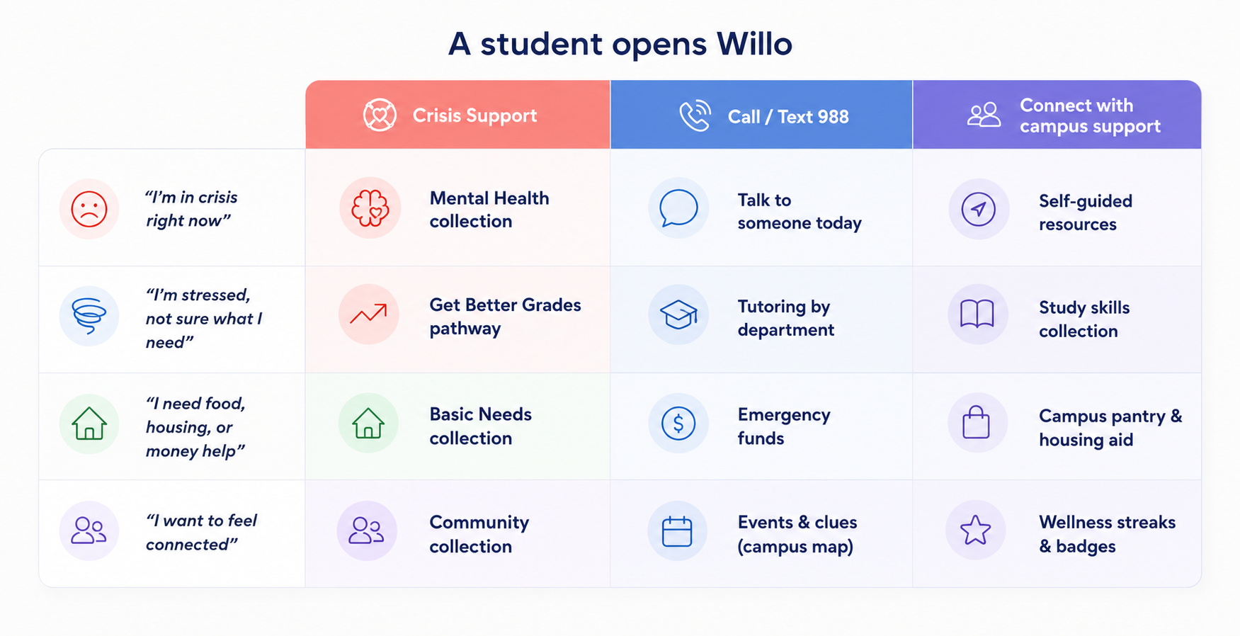
Student support roadmap
The redesign
04
The redesign focused on one core goal: making Willo easier to navigate, whether a student was looking for something as simple as a campus event or as critical as immediate mental health support. The examples below show how that principle shaped the experience across the entire platform.
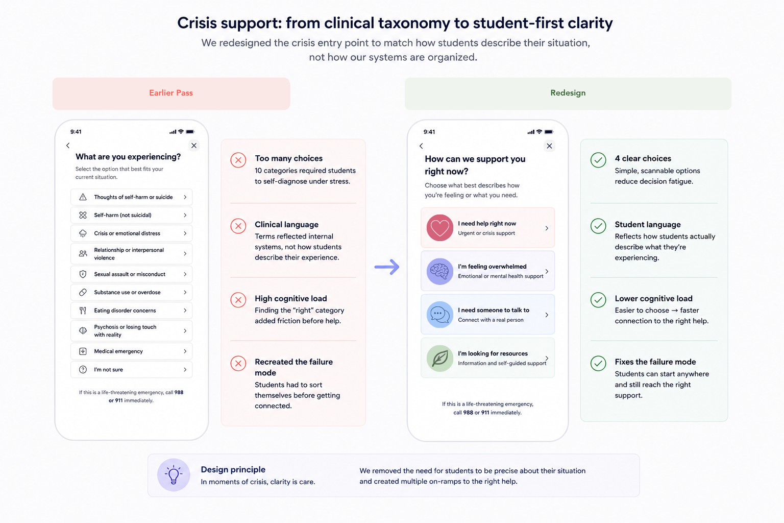
Crisis support UI design comparison
Part 1 · Curated pathways instead of a resource directory
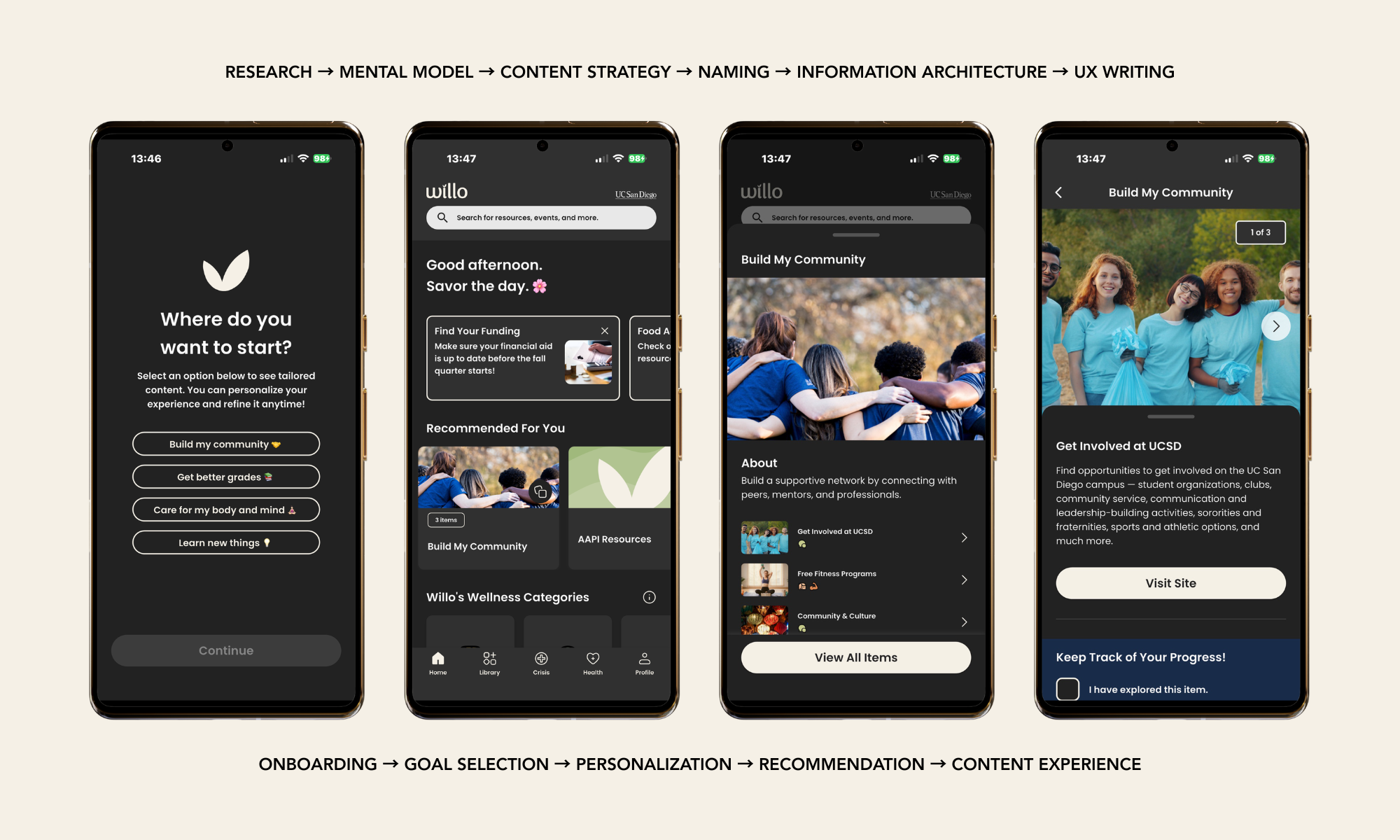
Research revealed that students weren't looking for more resources, they were looking for a single source.
I redesigned Willo's content strategy and information architecture around student goals, transforming a directory of disconnected resources into curated pathways that guide students from onboarding to personalized recommendations and meaningful action.
Replace exploration with progression
Curated pathways transform an open-ended resource directory into a guided journey, reducing cognitive load by helping students focus on one step at a time.
Reduce decisions to increase action
Every screen centers on a single primary call to action, minimizing choice overload and creating a consistent path from discovery to support.
Organize around student mental models
Names, pathways, and collections reflect how students describe their goals rather than how campus departments organize services, making information easier to find and understand.
Part 2 · Crisis support, designed to reduce confusion under stress

Four pathways instead of clinical taxonomy
The crisis experience was simplified into four student-centered pathways. Clinical partners confirmed these reflected the vast majority of real triage scenarios while eliminating the need for students to navigate the university's internal service structure.
The fastest path to help comes first
The 988 Suicide & Crisis Lifeline is surfaced before campus-specific resources. In moments of crisis, immediate access and availability take priority over institutional ownership.
"I'm not sure" is a valid starting point
Research showed many students experiencing distress couldn't immediately identify what kind of support they needed. Rather than requiring self-diagnosis, the experience treats uncertainty as an expected state and guides students to the appropriate care from there.
Design Decision · Balancing Clinical Expertise with Student Needs
WHERE CLINICAL JUDGMENT AND UX JUDGMENT PULLED IN DIFFERENT DIRECTIONS
One of the most important design decisions centered on how the 988 Suicide & Crisis Lifeline should be presented alongside campus-specific emergency resources. Clinical partners brought valuable expertise grounded in established crisis triage models, while student research revealed a different need: in moments of distress, students prioritized the fastest, clearest path to help over understanding which organization provided it.
Rather than treating either perspective as the default, we returned to the evidence. We tested the language, hierarchy, and interaction flow with students to understand what reduced hesitation and increased confidence. Those findings informed the final design: 988 is surfaced immediately and labeled in plain language, with campus resources presented as complementary pathways rather than competing entry points.
That decision reflects the broader approach behind the project. Clinical expertise established what needed to be safe and clinically appropriate. Student research determined how that guidance should be experienced.
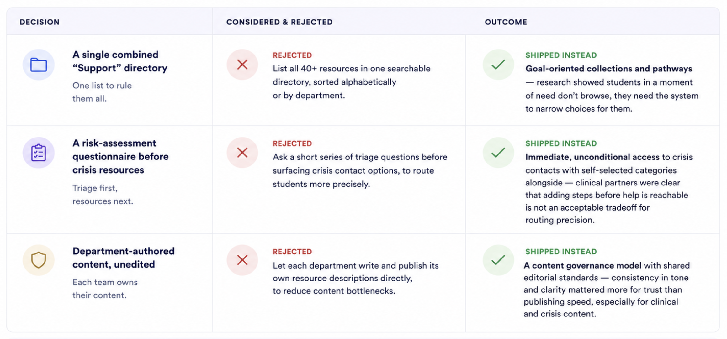
Decisions Process
We evaluated multiple approaches early in the design process. Here are the key options we considered, why we rejected them, and what we shipped instead.
Impact
05
This case study documents decisions that were implemented in production. Each outcome represents a shipped change to Willo's content strategy, information architecture, or interaction design.
40+ → 1
fragmented campus and clinical systems consolidated into a single discovery experience.
Core outcome of the information architecture and content model work.
V2 → V5
joined at the tail end of version 2, then shipped three major versions, including a dedicated crisis and clinical redesign.
Reflects sustained, iterative investment rather than a single redesign event.
45,000+
students with access to the consolidated platform across UC San Diego
Full enrolled student population as of the most recent academic year.
Reflection
06
What I'd revisit, and what I'd carry into any future well-being or care-adjacent platform.What I'd revisit, and what I'd carry into any future enterprise content operation.
WHAT I'D CHANGE
Earlier versions leaned on department stakeholders for content; involving clinical partners from the very first IA draft, not just the crisis flow, would have caught some structural issues sooner.
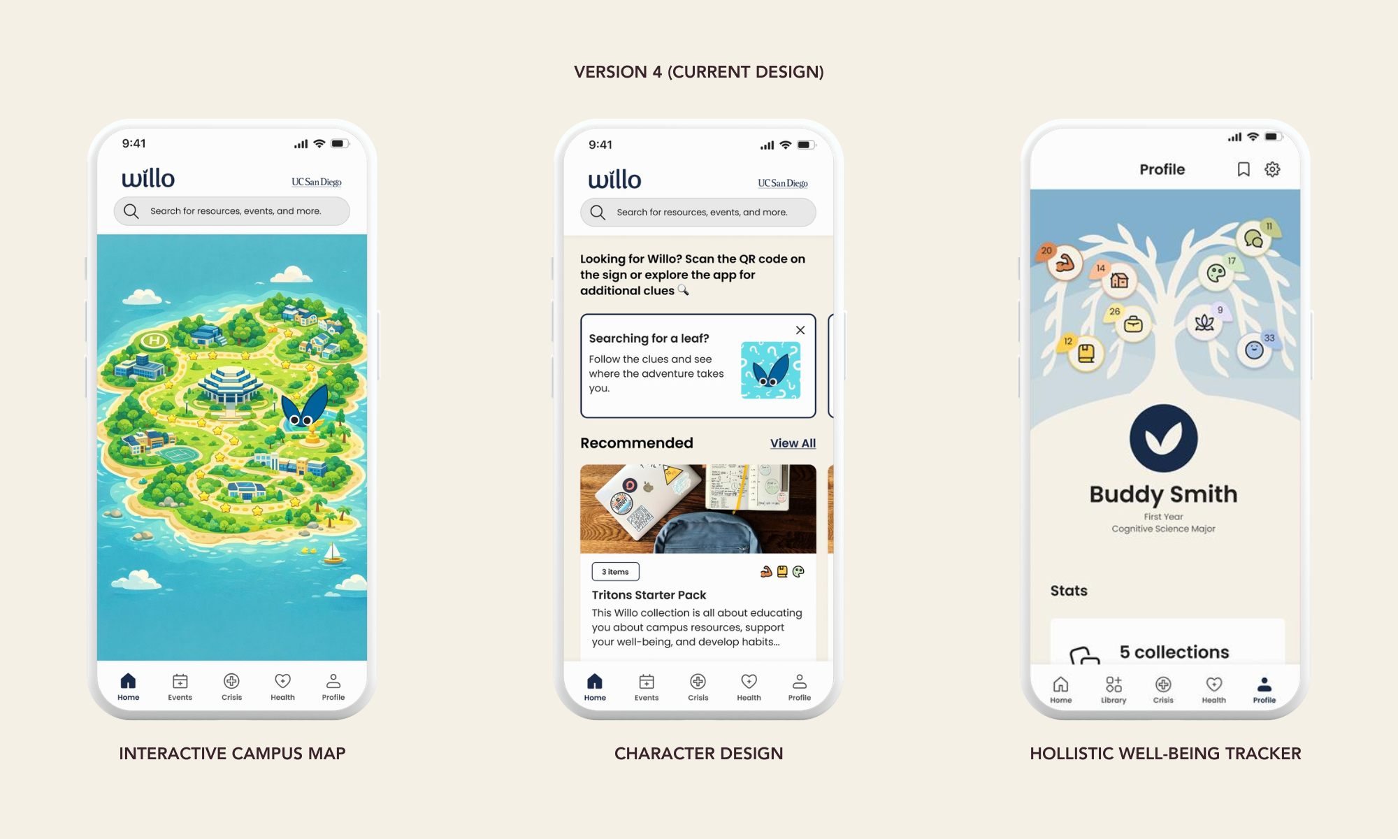
Wellness “collections” work well for proactive students but I'd want more research on whether they reach students who never open the app until they're already in distress.
I'd push for a lighter-weight way to update crisis resources (phone numbers, hours) without a full content-governance cycle, given how quickly that information can change.
WHAT I'D CARRY FORWARD
Organizing around moments of need instead of departmental ownership is the single highest-leverage IA decision I've made — it applies far beyond well-being products.
Treating clinical partners as co-designers of the crisis flow, not stakeholders to consult after the fact, should be the default for any care-adjacent product, not the exception.
Removing the requirement to self-diagnose before reaching help is a small interaction decision with outsized importance in moments of real distress.